“It used to be that there wasn’t a lot of color in the bathroom, so more color is definitely a newer trend,”says Jamie Drake, interior style guru and author of New American Glamour. “You still see a lot of white, crisp spa-like solutions, but even those often have bright accents.”
Neutral shades such as cream, beige and taupe have long been popular color choices for the bathroom because they wear well and fit easily into any design scheme. But these safe colors are giving way to bolder palettes that create a cheerful, fun place to wake up to every morning.
While bold can be beautiful, it’s not necessarily for everyone. “Color is crucial in creating different moods, so I create a range of palettes for a wide variety of lifestyles and looks, ” explains Leatirice Eiseman, director of the Pantone Color Institute, an Interior design industry leader in forecasting the hottest color trends.
Some might be surprised by the color pairings in the home color forecast for 2008. One palette, Wellspring, is particularly suited for a soothing and relaxing bath experience. Based on the properties of water, Wellspring uses shades of blue and aqua, highlighted by a glimmer of effervescent undersea green, violet and indigo. Mother-of-pearl and the sandy shades of the shore bring a beautifully warming balance.
Just a touch
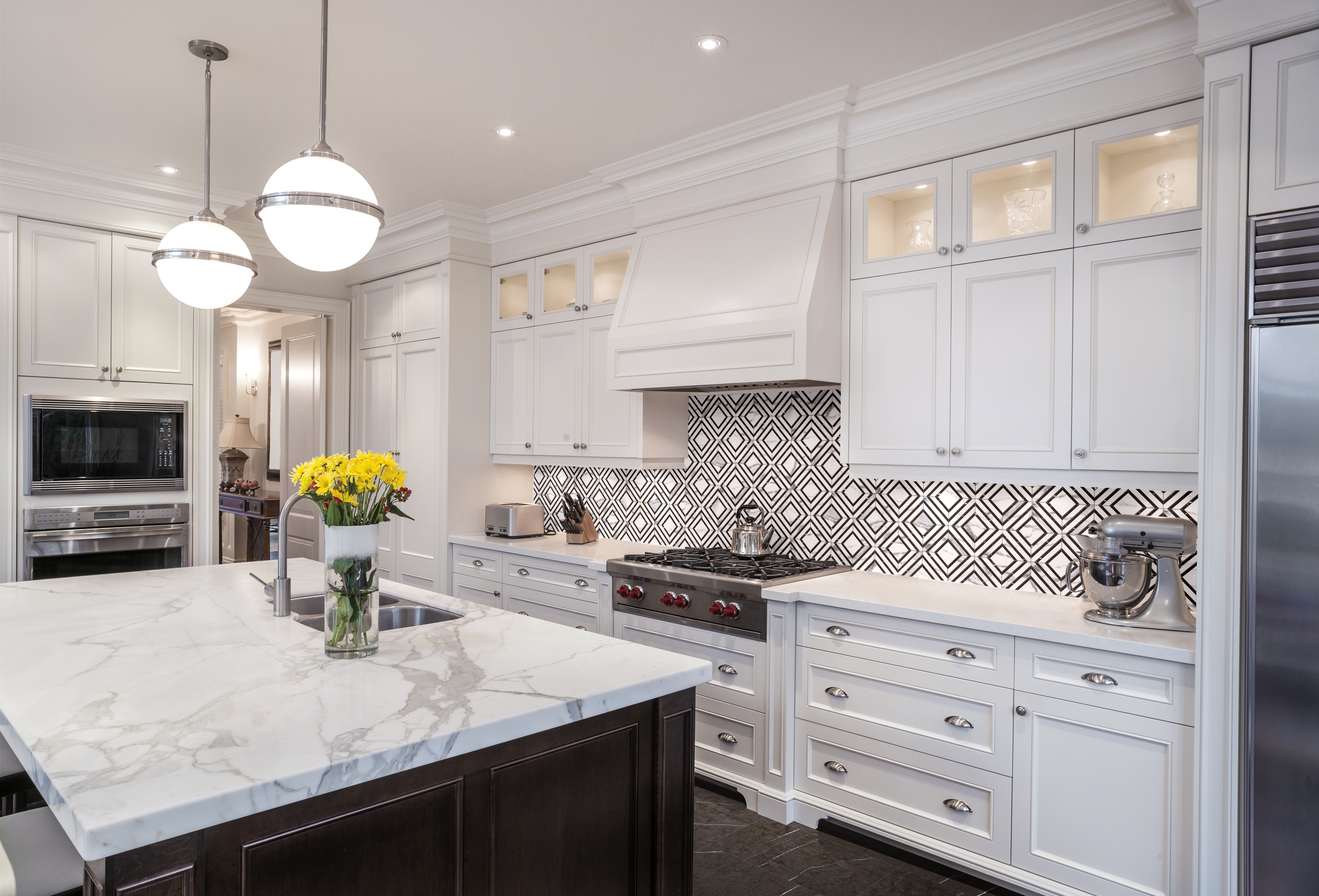
If you don’t want color everywhere in your bath, try adding small doses in cheerful colors such as sunny yellow or fire-engine red that are inspired by children’s bathrooms. Glass tiles are becoming more readily available in many bright hues and sizes, a small vanity backsplash would add punch.
For those who like to change color frequently, for example with the seasons, should consider sticking to a neutral tile and rotating accessories. “You can easily add a touch of updated color — and unexpected ‘aha’ — with towels, rugs, and other accessories,” says Eiseman. Try cool spa colors such as sapphire blue and seafoam green for spring, and brighter beach colors such as flamingo pink and chartreuse for summer. With the fall comes warmer shades of brown, while winter-influenced colors include candy apple red and maroon with an undertone of pink.
Drake is a fan of iridescent tiles with a mother-of-pearl sheen that changes with the light. “Even the white tiles are designed to shimmer and give off shades of turquoise, peach or lavender.”
Timeless Color
While we’re going to see more and more color in the bathroom, certain timeless guidelines still apply. “You want colors that are flattering to the skin — whatever you put on the wall will be the color reflected in your (face’s) shadowes,” says Jarrett Hedborg, whose celebrity clients include Jim Carrey, Bette Midler and Jeff Bridges. “I’ll never do a green bathroom because cool tones tend to be unflattering and make you look older. Yellow is another no-no, especially if you’re applying make-up, because it distorts your skin tone and makes you look jaundiced.”
According to Hedborg, most skin tones are pink, so you want warm tones that will pick up that color — such as peach and rose — and create warm shadows.
But don’t rule out those cool spa colors quite yet. “Some people will always like the soothing blues, blue-greens, greens and blue lavenders that enable tranquility and relaxations,” says Eiseman. “Ultimately, your choice of colors boils down to your expectations of what you want in a room that suits your comfort level.”

